
REDESIGN TABLE SELECTION
SHORTLY
This project was born out of several needs at the same time:
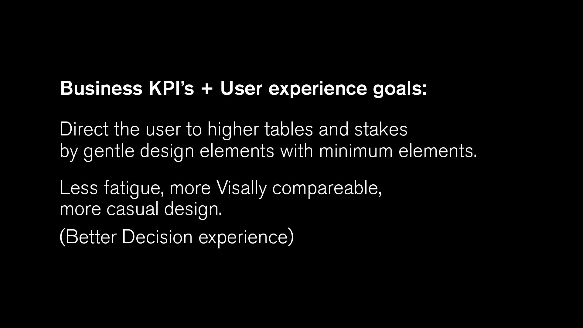
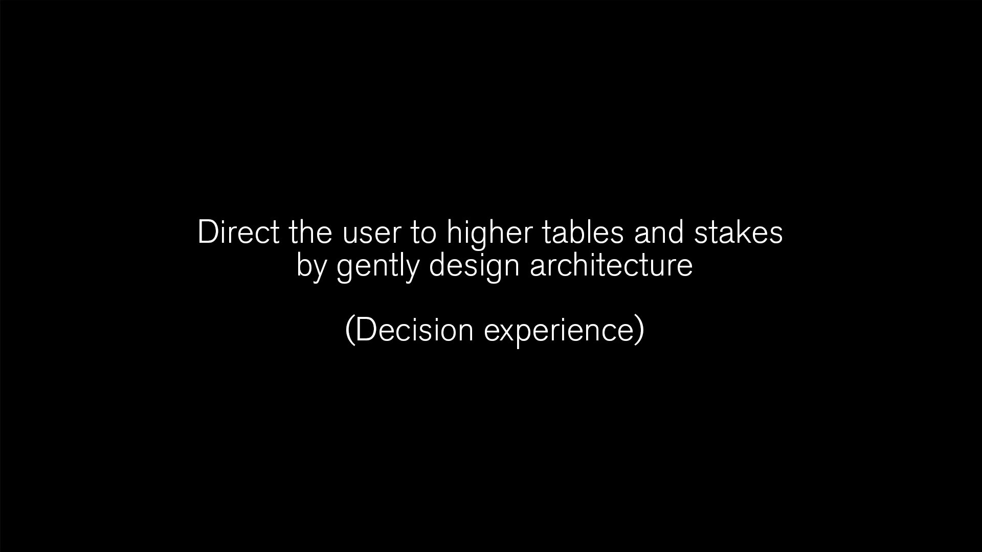
- Make the users choose to enter the tables with a higher investment
- Simplify and update the visibility of the Table selection screen (the preliminary screen for the game where the player defines and selects the game data)
- Redesign the choices so that their 'cost' and their benefits are clearer to the players
GOALS
- Increase users' bets
- Simplify user choices
- Improve the UX-UI in the game
MY ROLE
Owner of the feature & TF member
UX Design
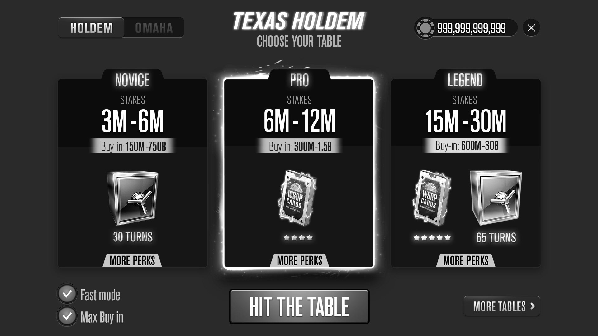
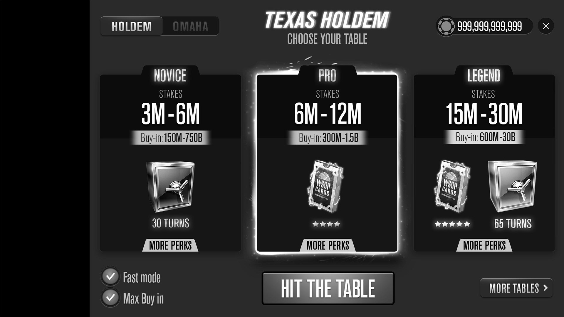
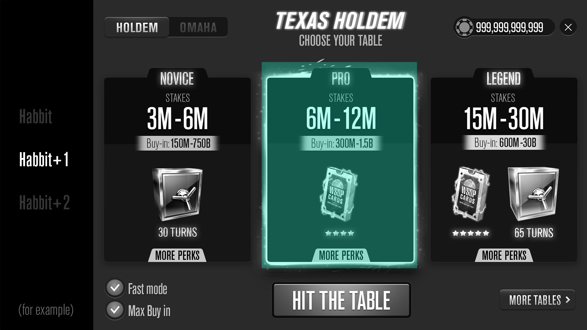
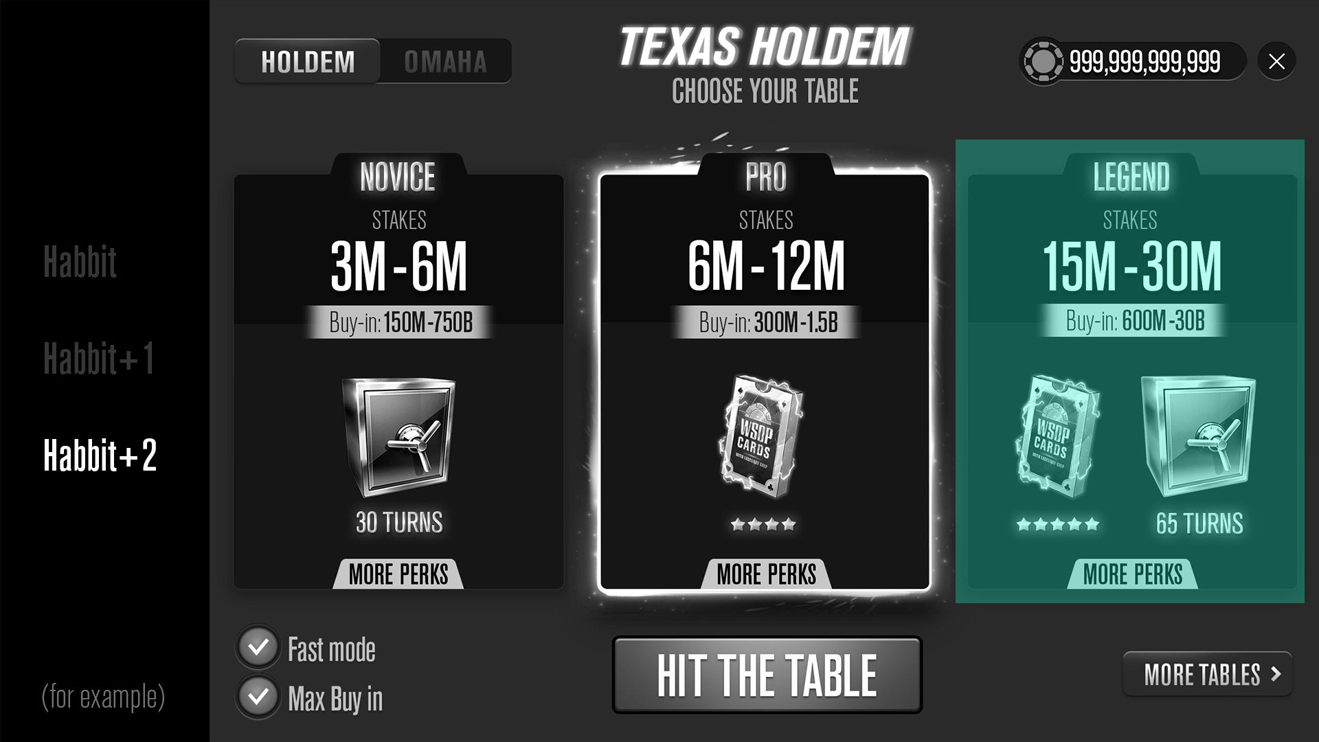
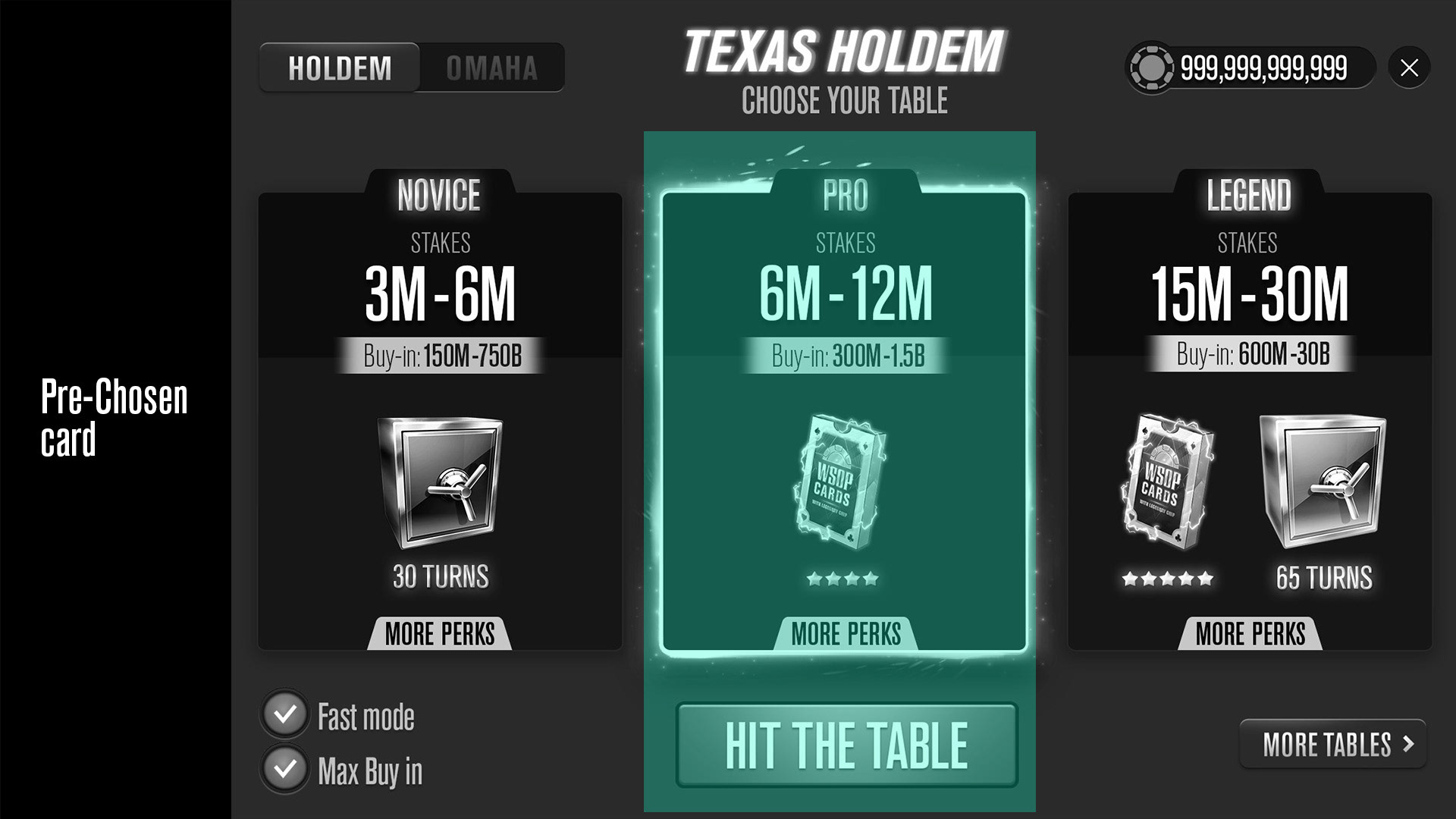
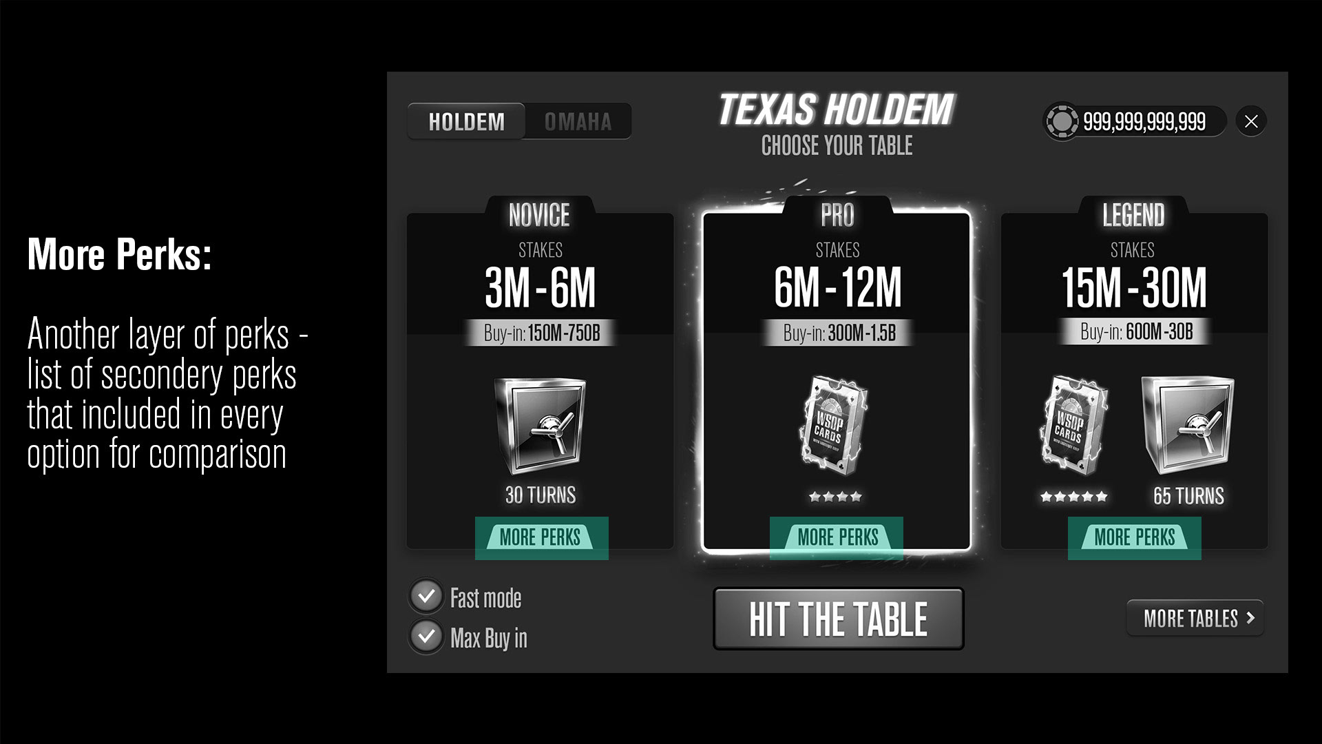
The middle card is chosen as the default
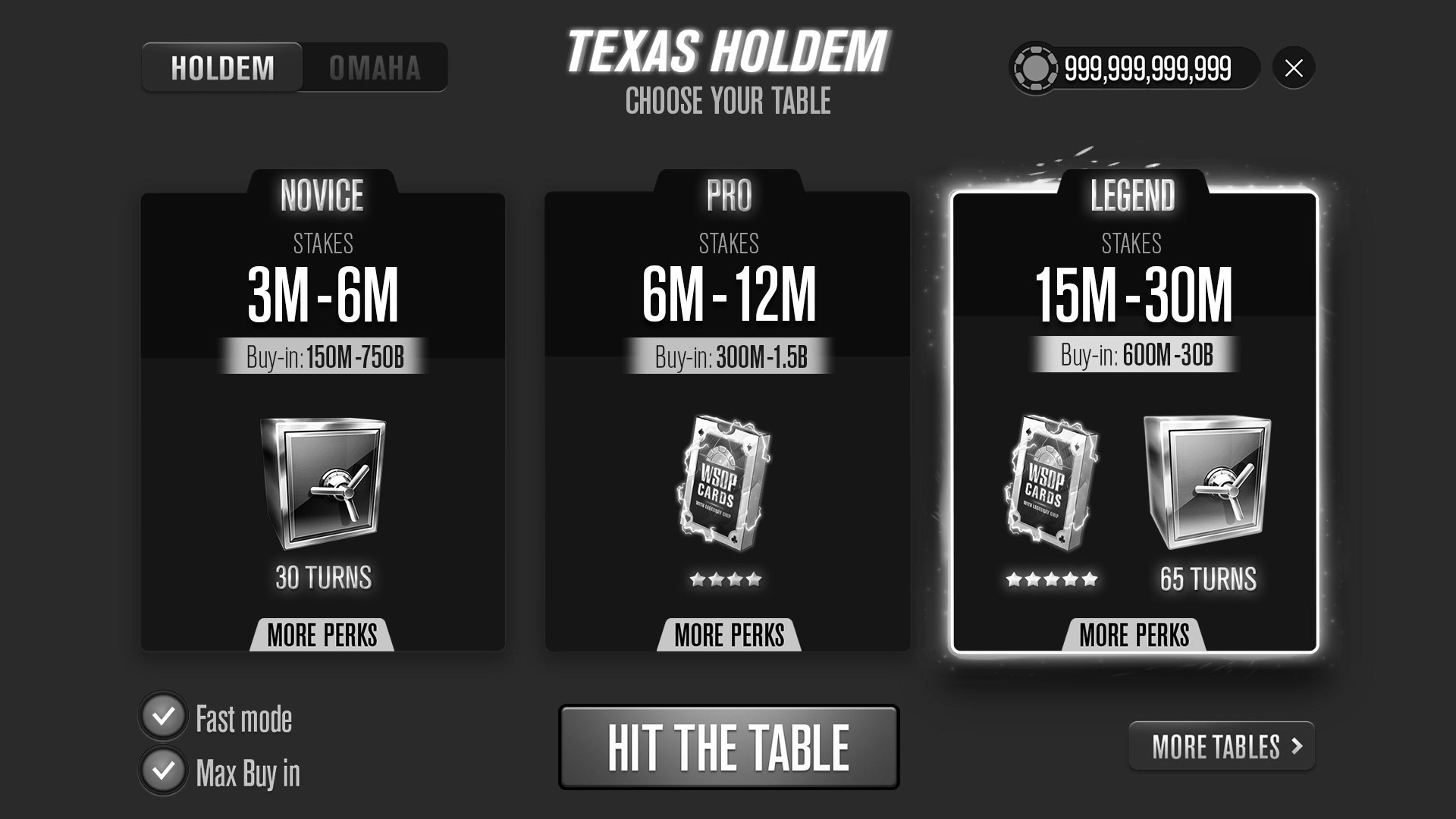
Clicking on another card marks it, but the final selection is made only by pressing the HIT THE TABLE button
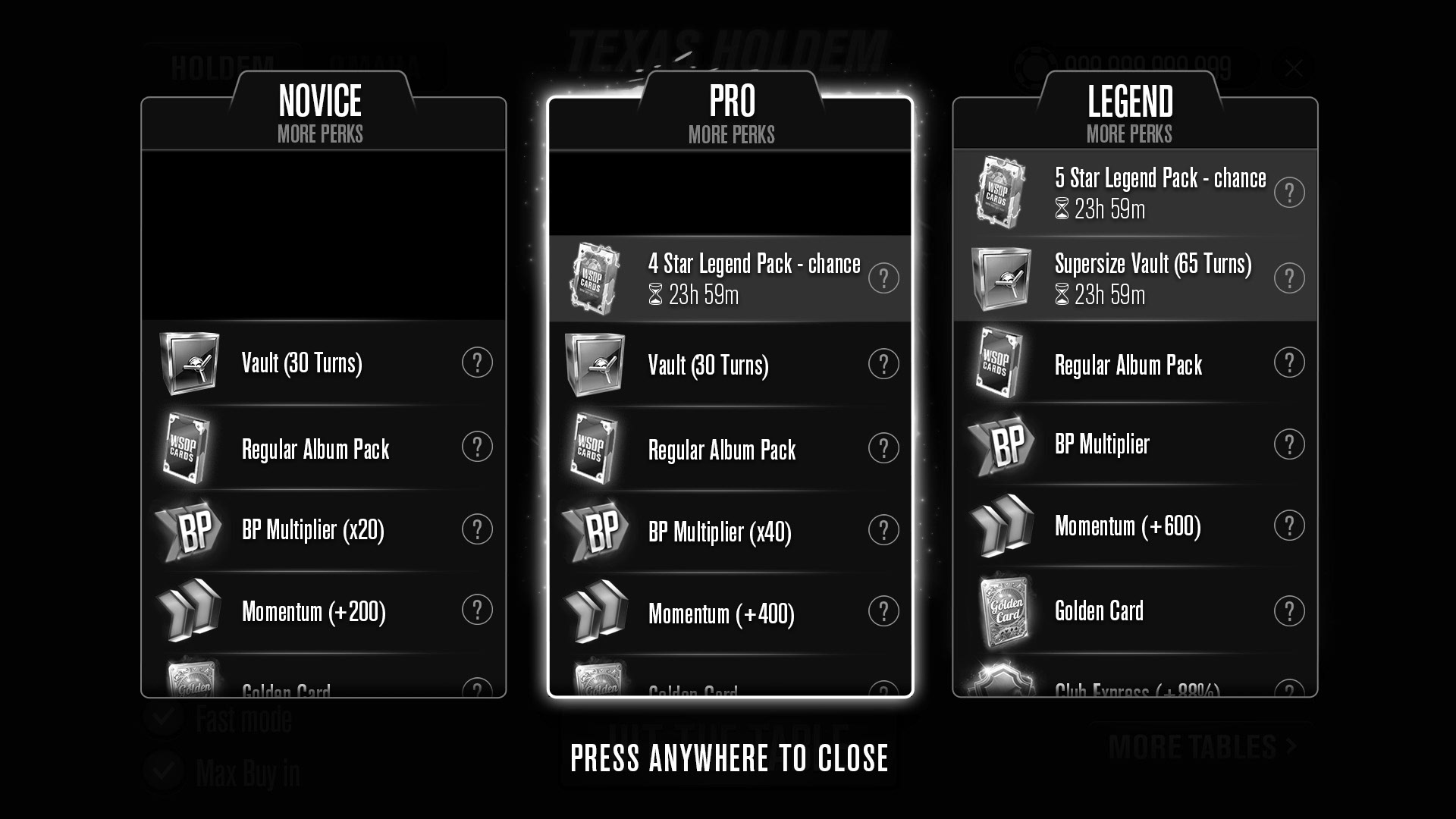
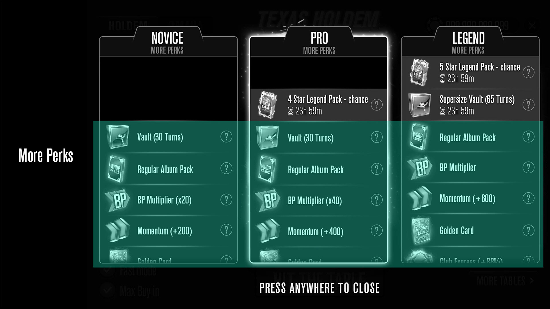
Clicking on the + sign at the bottom of the card reveals more information about the additional benefits inherent in each card in a horizontal comparative manner
the challenge
Beyond the usual challenges of designing a user experience, here is another significant challenge - changing a convention well known to players, The older and familiar selection process in our case.
When we 'move the cheese' to the users it is sometimes accompanied by objections. It's essential to create value within the new design and maintain credibility despite the change.
When we 'move the cheese' to the users it is sometimes accompanied by objections. It's essential to create value within the new design and maintain credibility despite the change.
UX PRESENTATION
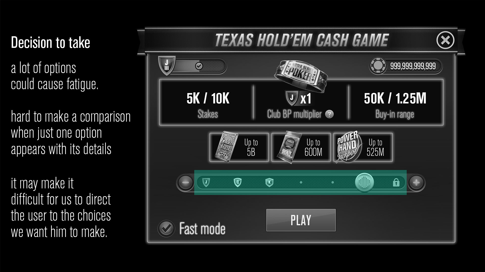
Following the principles of UX and UI and principles from the world of decision-making, I presented the structure of the new screen while breaking down and detailing the elements and needs according to which it was redesigned. Among others, principles such as Grouping, Fatigue, Choice's architecture, and more.


FINAL UI
